Bait and Switch
From Dark Patterns
Contents |
Definition
The user sets out to do one thing, but a different, undesirable thing happens instead. This is one of the oldest tricks in the book, and it is very broad in nature – many dark patterns involve some kind of bait & switch.
Example: Scribd.com (September 2010)
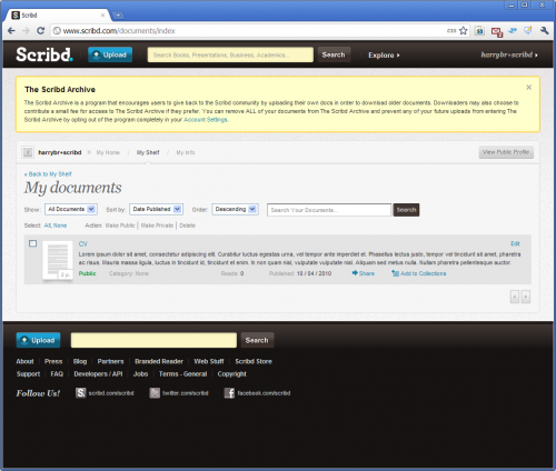
When Scribd.com originally launched, it was pitched as a "YouTube for documents". The "Free" end of its original Freemium business model allowed users to upload and view documents in an unlimited capacity, making money from display advertising. All of a sudden, in September 2010, Scribd.com put a substantial chunk of user uploads behind a paywall (see Eric Goldman's reaction: Scribd Puts My Old Uploads Behind a Paywall and Goes Onto My Shitlist). After a sizable negative public reaction, Scribd posted an apology, and changed its UI design slightly, to provide what they claim as "Clear opt-out" and "Proactive messaging". In other words, they now provide users with a way to circumvent the paywall, if they have the patience and the ability to navigate through the site.
Scribd.com is listed as using a Bait and Switch pattern, since the grounds upon which end users are invited to upload content ("...upload your PDF, Word, and PowerPoint docs to share them with the world's largest community of readers." as advertised on the scribd.com homepage) are somewhat different to the reality of the situation users find themselves in after uploading.
Above you can see the page a user reaches at the end of the document upload journey. Rather than presenting any UI controls to allow the user to opt in/out at this point, they present an obscurely-worded information box, and a link to "Account settings", which the user needs to proactively click in order reach the UI controls. The text of the information box is:-
When a new user attempts to download a file, they are asked to either upload a file first (thus increasing the size of scribd.com's document library), or pay for access.
Example: TheLadders.co.uk (September 2010)
When a user visits TheLadders.co.uk homepage, they see the claim "The best way to find only £50k+ jobs". Underneath this heading is a prominent search form.
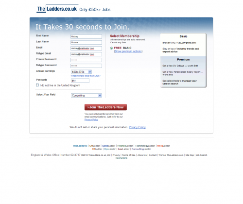
The search UI is essentially a decoy: users cannot search until they have registered (see below). However, registration has a free option that allows users to "Browse ONLY £50,000 plus jobs!" (quoting from screengrab below). This sounds fair enough, but it is very misleading, as you will see shortly.
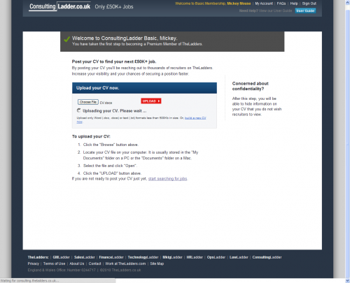
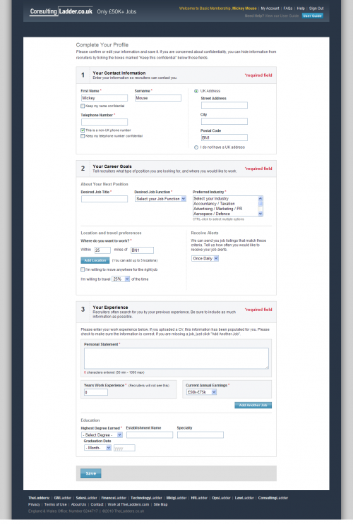
Having registered, users are asked to import or create a CV (as shown in the following two screengrabs). It appears to be a mandatory part of registering - so most people will go ahead and publish their CVs, willing to jump through any hoops in order to see these enticing £50K+ jobs. CVs have a cash value for the site owners - each CV is added to their CV database, and access to that database is sold to recruiters for £349 a week.
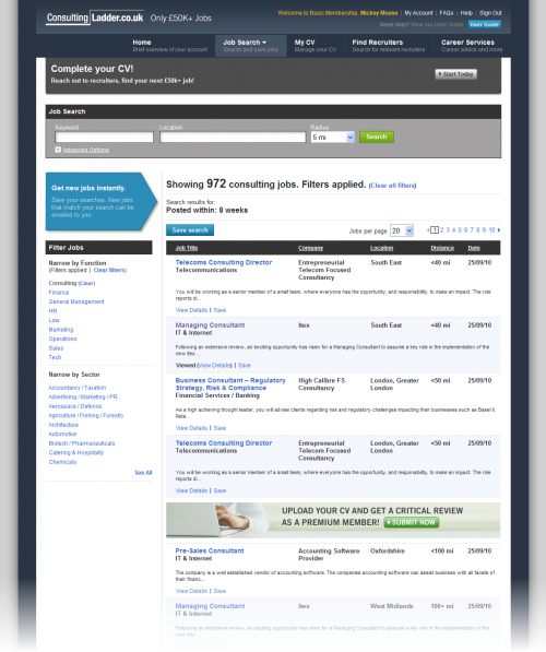
Finally the user finds themselves in the logged-in area of the site. You can imagine they must be chomping at the bit now, really wanting to find and apply for some of those elusive £50k+ jobs. Looking at the screengrab below, let's imagine that the user thinks the "Managing Consultant" job seems to be a good fit.
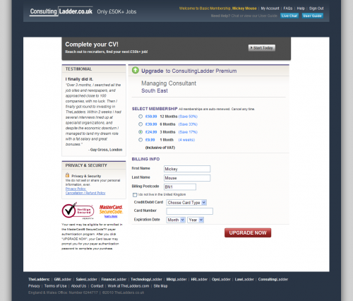
So what happens when the user clicks the "Managing Consultant" link? Let's see (below)...
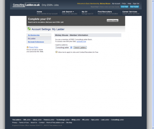
We've hit a paywall - the user has to now set up a monthly payment before they are allowed to see the job details or apply for the job. What happened to the "free" membership deal? It turns out, free only applied to the act of searching for jobs and viewing search results, but not viewing jobs. The problem for TheLadders.co.uk here is that UK law forbids companies from charging job-seekers to view or apply for job ads (refer to The Conduct of Employment Agencies Act for details). So how does TheLadders.co.uk circumvent this problem? They make it possible for users to view & apply for free, but they bury this option in a subsection of the user's account area (account settings > my ladders), as shown below:
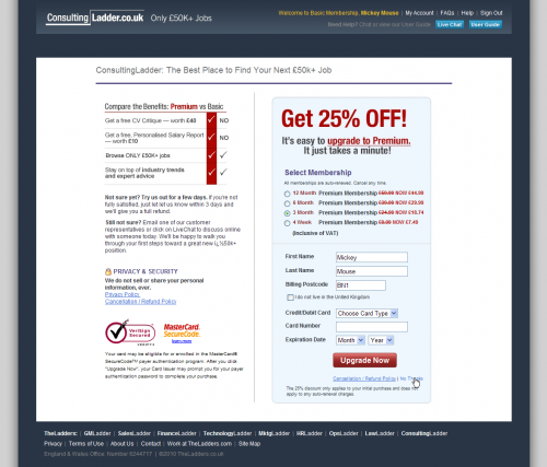
Having ticked "Allow me to apply to Jobs and Contact Recruiters for free", the user will expect it will be plain sailing from here on. Not so. If the user now goes back to the "managing consultant job listing, and clicks on the hyperlink, they are taken to this page (below):
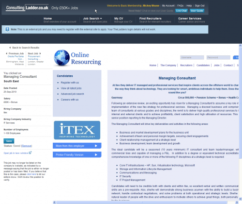
If the user clicks the tiny "No thanks" link, they can eventually get to the job ad. Let's see what happens when they click "apply now":
We are now looking at an external site, wrapped in an iFrame. In other words, this ad is available for free elsewhere on the web, TheLadders.co.uk is simply linking to it. It is not clear at the time of writing how much of the content on TheLadders.co.uk is in fact freely available elsewhere on the web.
Example: Nike’s world cup 2010 Facebook advert (May 2010)
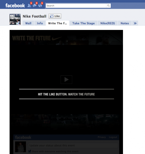
As reported by Paul Adams (“Hey Nike, Get your crap out of my newsfeed”), in May 2010 Nike used a rather nefarious tactic of forcing users to click “Like” in order to see a World-cup football video. As a naïve user, “Like” doesn’t quite do what you’d expect – rather than just indicating to your friends that you like something, you are actually gives that thing permission to put content into your news feed (in this case, an advertisement). Savvy users have come to understand that clicking “like” can have this effect – however, this is some distance away from a user’s initial expectation.
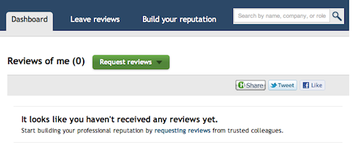
Example: Honestly.com (May 2011)
As reported by Phil Freo ("Honestly.com not acting so honestly"). Honestly.com uses a tactic to bait unregistered users into thinking they received an anonymous review from someone in their social graph. Only after registering, "opting in" and disclosing their social graph, the user finds out there is no review.
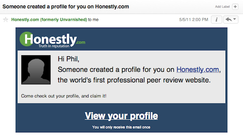
It goes something like this... an email is sent to a prospective user with the subject of “Someone created a profile for you…” (or similar verbiage), which leaves the impression that someone has left a public review about the user. Upon clicking the link to the user's only option is to login with Facebook and give Honestly their Facebook info and a list of all the friends with the intention that the user will see a review. After completing the process, the user learns that there is no review.
The "Process"
- Login to Facebook
- Get your email address
- Try to get your email contacts
- Try to get your LinkedIn contacts
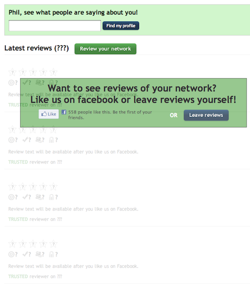
- "Like" them on Facebook. Specifically, they reveal this statement: “Review text will be available after you like us on Facebook.”
