Roach Motel
From Dark Patterns
Contents |
Definition
The "Roach Motel" is a broad category of Dark Pattern that subsumes most types listed on this site. Put simply, a Roach Motel makes it very easy for a user to get into a certain situation, but then makes it hard for them to get out of it when they realize it is undesirable.
Email newsletter unsubscription is a well known example – whereby it is typically easy to subscribe, but much more effort is needed to unsubscribe. The revised CAN-SPAM 2008 rules state that this practice is forbidden for emails that have a primary purpose "to advertise or promote a commercial product or service". (Unfortunately, CAN-SPAM does not cover "transactional or relationship" messages.)
Example: Wired.co.uk (December 2010)
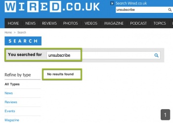
Trying to unsubscribe from paying for delivery of the print edition of Wired magazine (in the UK) is far more difficult than it should be. This is likely to cause users to drop-out from the unsubscription process, causing Wired to generate more revenue than they would otherwise have done. Here's a walk-through of one user's attempt to unsubscribe. First, the user goes to the Wired UK website. They start off by doing a search for "unsubscribe" using the site search engine.
As you can see above, the search returns no results. The user then goes on to read the items in the main navigation bar. The "Magazine" section has the right information scent - perhaps there's something in there?
Secondary navigation appears, in which there's an option to subscribe, but not unsubscribe. The user clicks on subscribe, just to check.
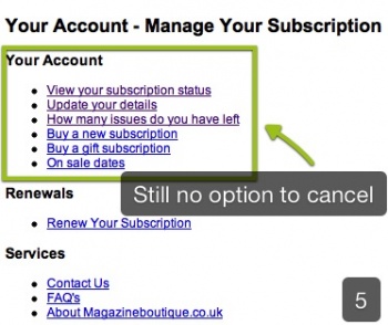
The user finds themselves on a busy page containing a subscription form. the very bottom of the page in small type it says "you can cancel at any time" but it doesn't say how to do this (as shown above). Realising it's a dead-end, the user clicks "Contact Us" at the top of the page, and then they click "Manage your subscription" which sounds promising. They find themselves on the page shown below:
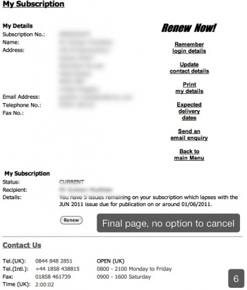
Once again, there is no clear option to cancel the paid subscription. Finally, the user tries "View your subscription status", and is taken to the page shown below.
The user now realises this page only allows them to renew - not cancel. The other options such as "Update your details" also revealed no option to cancel. Ultimately the user decides to write an e-mail requesting their subscription to be cancelled.
Example: LAfitness.com (August 2010)
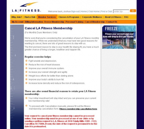
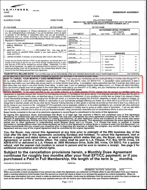
In the USA, LA Fitness currently allow users to sign-up for a membership online, but if they want to cancel their membership they have to do so by snail mail, as shown below.
Example: geni.com (September 2010)
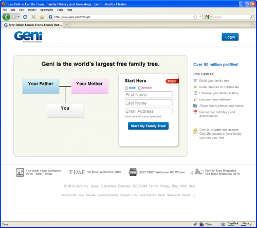
The geni.com sign-up process is very elegant and well designed. However, what they don’t tell you is that in signing up, you are also opting in to 19(!) different types of email notification, including Geni.com marketing emails. As you may know, emails are a very valuable way of generating return traffic to a site. They obviously know this and are trying to discourage users from opting out through the use of “anti-usability”.
As you can see in the homepage / sign-up form above, there is no mention of notification options. Once signed up, you start getting quite a few emails. Most emails have a footer in that looks similar to the screen grab below. Note that they are inviting the user to unsubscribe from email alerts of a specific type (in this case, “new additions to your family tree”), of which there are 19 different types.
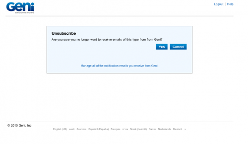
If the user clicks unsubscribe here, they are taken straight to an unsubscribe page, as shown below. No login required.
This is good, white-hat design (which implies that perhaps the original designer of the system had good intentions). However, if the user wants to unsubscribe from everything, they have to click the link at the bottom of the box (“Manage all of the notification emails you receive from Geni”). If the user simply clicks “Yes”, they are taken to their profile page, and their notification subscriptions are not displayed to them.
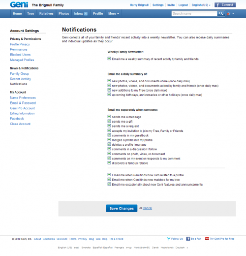
If a user manages to navigate their way to the notification page, they see a bewildering array of 19 notification subscriptions (shown above). They have to manually untick all 19: there is no single control to unsubscribe from them all. If you look closely at the options, you’ll notice that the 19 options could easily be condensed into 4 options, or at the very least, the user could be given the ability to bulk administer their subscriptions. In summary: a very naughty piece of anti-usability.
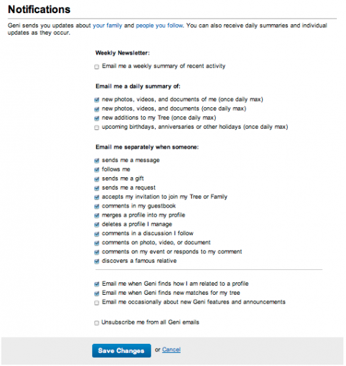
Update (Dec 2010): they have updated this user interface to allow users to opt out of all subscriptions in one click, as shown below. This is likely to have been in response to this wiki entry.
Example: Very.co.uk (October 2010)
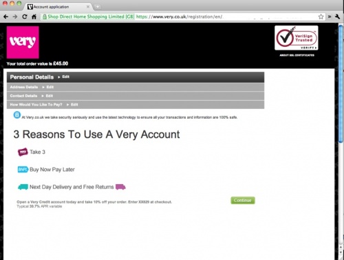
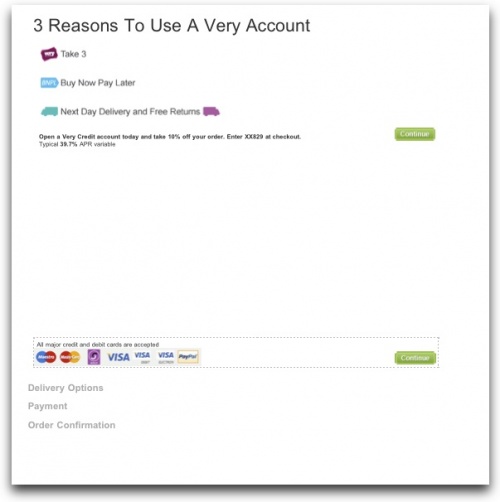
During the checkout process, very.co.uk have an option to pay using their own brand credit card (which requires you to sign up for one as part of the process). They cheekily hide the "pay with your own credit card" option right down at the bottom of the page, beneath a great sea of white space. When you first load the page up, this is what you see:
The page layout and the single "Continue" button makes it easy for the user to assume that this is the only option on the page. In fact, if the user scrolls down, they will find a gulf of white space, and at the very bottom, they will see the option to pay with a different credit card:
Once a user has mistakenly gone down the route to sign up to their own-brand credit card, it's very difficult (if not impossible) to return to this stage again without having to start the whole shopping process anew.
Although this is a dark pattern, it is poorly implemented and is unlikely to be delivering them great conversion rates on credit card applications or eCommerce transactions.
