Misdirection
From Dark Patterns
Contents |
Definition
The attention of the user is focused on one thing in order to distract its attention from another.
Example: Experts-exchange.com (October 2010)
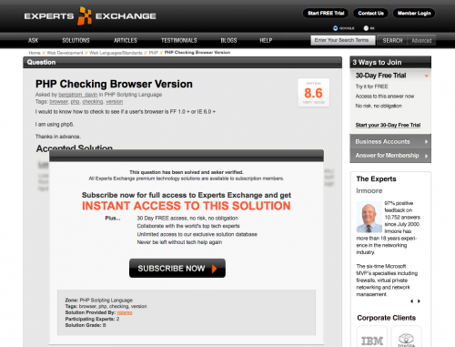
Experts exchange is 'a technology help website'. Paid members can ask questions which other members can answer. In most situations users will encounter experts exchange while searching Google. When a user tries to view a solution this is what they'll see:
User are tricked into thinking they need to sign up for experts exchange to view the answer. Look how cleverly they show a blurred image of the supposed solution underneath the massive banner.
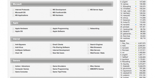
What the user doesn't know is that the actual answer is hidden from view. If you first start to scroll this is all that you see:
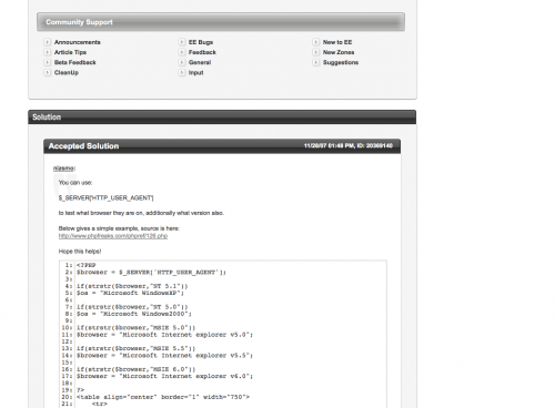
Those links are all completely useless navigation to other parts of the website and serve only one purpose: to hide the actual content. If you scroll down long enough you eventually get to the answer:
To get an impression how much the user needs to scroll take a look at the following scaled image of the page:
Note: after a number of views Experts-exchange hides the answers completely. By removing all 19! cookies the answers become visible again.
Discovered by Kamiel Martinet on October 1st, 2010
Update (December 11, 2010)
As of December 11 2010, experts exchange have completely hidden all knowledge.
See for example: http://www.experts-exchange.com/Applications/MS_Office/Excel/Q_20805544.html which is a page about not being able to empty the clipboard in Excel. On checking the source, no answer was to be found.
Experts-exchange is actually much more devious than that: if they find out that your source website is Google search (and possibly other search engines) they will show you the answer.
Click on this link: [1] and click the experts-exchange result, if you scroll down you'll get the proper answers. But if you go to the resulting page [2] directly, you don't get the result.
This is caused by Google's policy that states something along the lines of: "if your website shows different content to our search robots than it does to the public, you'll get banned".
Example: MoneySupermarket.com (October 2010)
This is a similar example, albeit a little less extreme.
When a person follows the unsubscribe link from MoneySupermarket's email newsletter, they are presented with this page. The focus of the page is clearly the signup form for another newsletter, presumably the same one that I am trying to unsubscribe from. The actual unsubscribe field is presented at the bottom of the page, in a location which would probably not initially be visible on most people's browser screens. This could also be seen as an example of the Roach Motel Dark Pattern.
Discovered by Sam Sutton on October 27th, 2010.


