Sneak into Basket
From Dark Patterns
Definition
The user attempts to purchase a specific item. However, somewhere in the purchasing journey the site sneaks an additional item into their basket, often through the use of an opt-out radio button or checkbox on a prior page.
Example: Rac.co.uk insurance
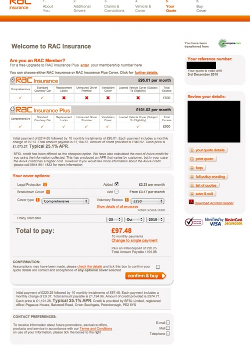
This example combines a number of different Dark Patterns. When buying insurance on Rac.co.uk, the user eventually reaches a "Quote" page, equivalent to a basket view page. Two prominent monthly payment options are shown. There is in fact a third, substantially cheaper option. If you look at the grey box below the "Confirm & buy" button, small text explains "each payment includes a monthly charge of £9.37. Total amount payable is £1,194.96. [...] Cash price is £1,101.26". If the user notices this, they can click the orange text link "Change to a single payment" (above the "confirm & buy button") and save £93.70. Thus, as well as being an example of the Sneak into Basket dark pattern, it is also an example of the Price Comparison Prevention dark pattern.
As well as this, you will also notice that the "Legal Protection" checkbox is preselected, so an unsuspecting user will not only pay over-the-odds with monthly repayments, they may also end up mistakenly buying legal cover too.
Example: Travelocity.com (July 2010)
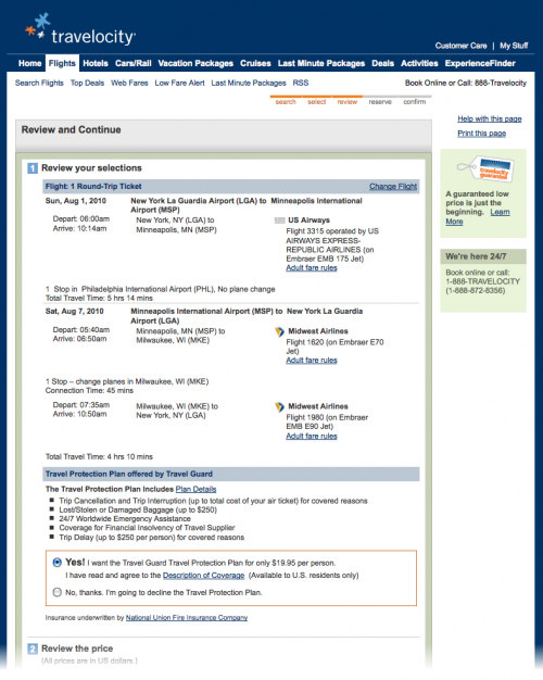
On Travelocity.com, they show an interim page before you get to the basket (shown below), which claims to be for you to review stuff (review your selection, the prices, their policies). Sneaked into this cluttered page is a question regarding purchasing insurance, which is defaulted to "yes". Due to the way the page is designed, a certain percentage of users will not notice this question and will proceed through the payment pages none the wiser. Having made the purchase, if they even realise they have mistakenly bought travel insurance, they then have to decide whether it's worth the effort to find the phone number, call the call center, find the right department, get put on hold, and ask to cancel the insurance. For many people, $19.95 is smart pricing as it is not quite at the threshold of noticing and taking action.
Example: 123-reg.co.uk
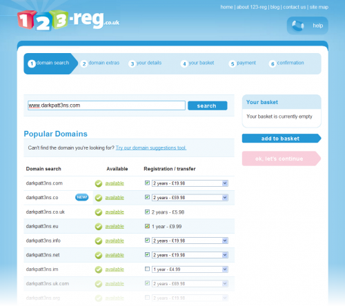
If you search for a specific domain name on 123-reg.co.uk (last recorded July 2010), 123-reg does you the non-courtesy of preselecting a load of other top-level domains for you (.co, .co.uk, .eu, etc), many of them preselected with 2-year rather than a cheaper 1-year duration. To their credit, they don't try to hide it - the pre-selected options are brazenly displayed. However, it's frustrating for users and it is is very likely to result in some users mistakenly purchasing items they never originally intended to.
Example: Tigerdirect.com (July 2010)
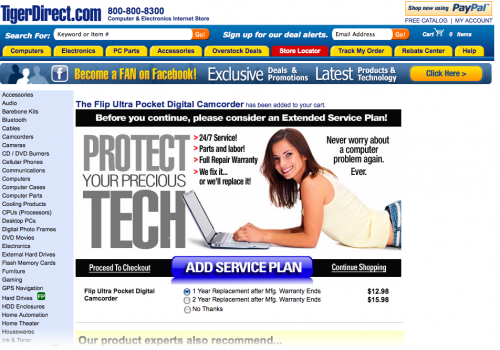
When you add an item to your basket on tigerdirect.com, you are taken to an interstitial page (shown below) that gives you an upsell message regarding an additional service plan. If you click "continue shopping" or "proceed to checkout" without looking at the radio buttons below, you end up with the service plan in your basket. Easy to overlook and end up buying something you don't want.
Example: Comet.co.uk (August 2010)
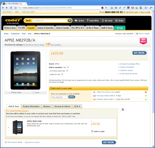
When buying an iPad on comet.co.uk, they sneak an iPad case into your basket via a pre-ticked checkbox, shown at the bottom of the screen grab below.
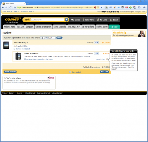
This is a slightly more ethical variant of the Sneak into Basket dark pattern:- on the Basket page (shown below) they highlight the fact that they've put something in your basket without you explicitly requesting it. Even with this highlighted area, it is likely that a certain percentage of users will pay for the upsell without realising it.
Example: Register.com (August 2010)
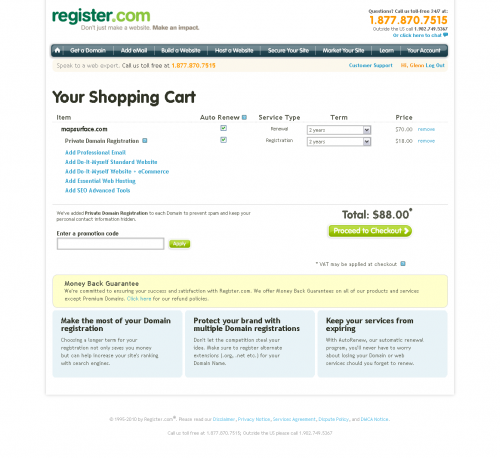
When renewing a domain name using register.com, they automatically default the period to two years (rather than one) and sneak in private domain registration, shown below.
Example: iStockPhoto (September 2010)
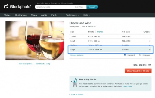
When users add photos to their basket on iStockPhoto, they have to be careful as largest (and most expensive) option is set as the default, and this is not strongly emphasised. The result here is that a small but notable percentage of users will buy the most expensive item without realising. The honest approach would be to avoid any default altogether, so the user has to make an explicit choice as to which size they wish to purchase.
Example: Air New Zealand (September 2010)
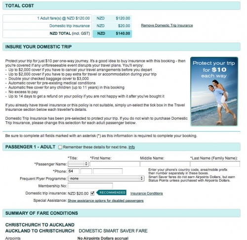
In the Air New Zealand screengrab below, you can see that the insurance purchase checkbox is pre-selected, making it an opt-out action. (Note: this occurs on the airnewzealand.co.nz but does not seem to occur on the .co.uk version).
Example: Flash Player / McAfee opt-out install
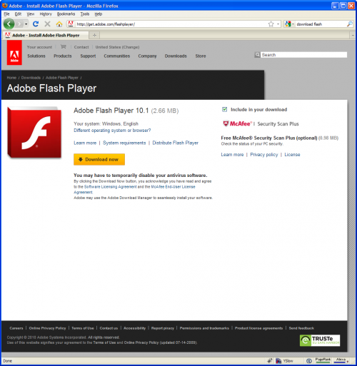
When using Firefox on Windows to download the newest version of Adobe Flash Player, users are shown the following page (October 2010):
As you can see on the right hand side of the page, the checkbox to download McAfee "Security Scan plus" is pre-selected, meaning that a certain percentage of unsuspecting users will download this software and install it without meaning to. McAfee Security Scan Plus has not yet been reviewed by any Darkpatterns.org contributors [verification needed], but the app seems to scan your system and if it discovers you do not have a firewall or virus software (etc), it suggests that you buy a related McAfee product. Rather than providing any actual functionality, it simply appears to be a sales device.
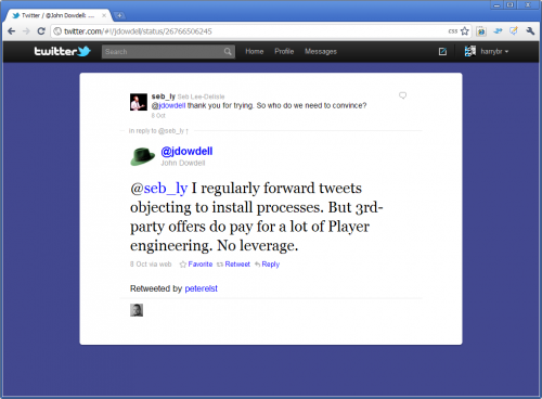
The above public tweet from Adobe Employee @jdowell makes it clear why the McAfee checkbox is pre-selected. McAfee are paying customers, and they apparently demand it to be designed this way.
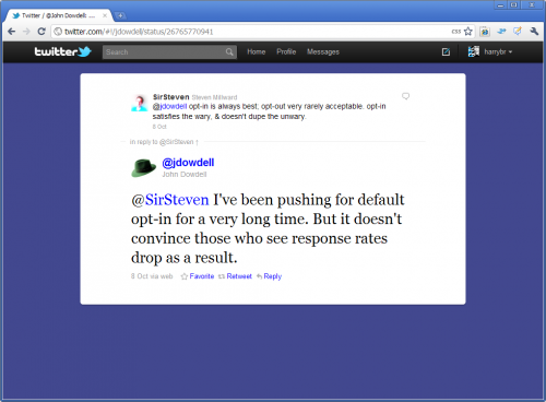
In another twitter conversation, @jdowell refers to the impact on conversion rates that an (ethical) opt-in design would have. (Thanks to @seb_ly and @plo for this example: further details on his blog)
Example: Norton Online Store
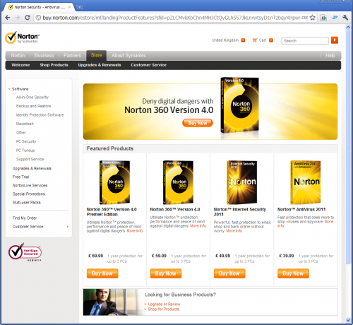
Below you can see a screengrab of the Norton online store.
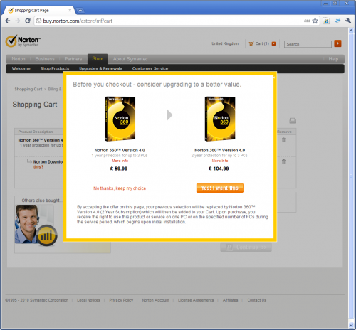
Let's say we want to purchase "Norton 360". If we click on that item, a lightbox appears, encouraging us to take an upsell, shown below:
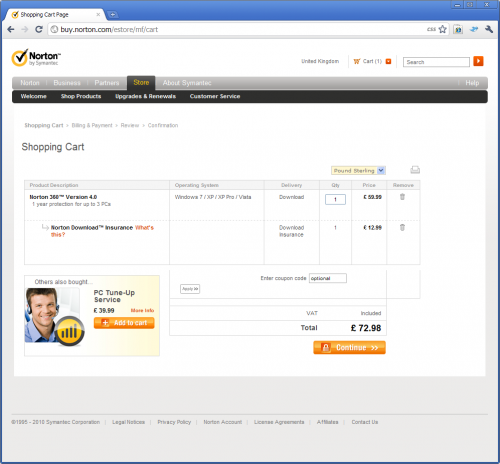
If we click either item, then we are taken to the shopping cart page, shown below. Note that "Download insurance" has been sneaked into the user's basket. According to the "What's this?" pop-up, this "...extends the time you can access your downloadable software by providing you the freedom and flexibility to download or re-download your software for one year." As such it's not really insurance and it's a service that most software providers give away for free.
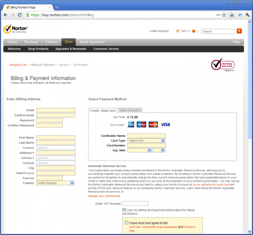
If we then proceed to the Billing & Payment page, Forced Continuity is also sneaked in - this means the user will have regular payments being taken from their credit card. The user can opt out of forced continuity before the purchase by clicking "Manage your preferences", but since it is small and hard to notice, users are unlikely to notice it. As such, if the user realises what's happened, after the purchase they have to log-in to their Norton Account and locate the relevant controls.
The Automatic Renewal Service text reads as follows:
Automatic Renewal Service Your subscription purchase today includes enrollment in the Norton Automatic Renewal Service, allowing you to conveniently maintain your product subscription and critical protection. By enrolling in Norton Automatic Renewal Service, you authorize Symantec to automatically charge the then-current renewal subscription fee (plus applicable taxes) to your credit or debit card without any additional action by you prior to the expiration of your product subscription. You may cancel the Norton Automatic Renewal Service at any time by visiting your Norton Account at www.myNortonAccount.com and turning off the auto-renewal feature, or by contacting Norton Customer Service.
Example: hoseasons.co.uk
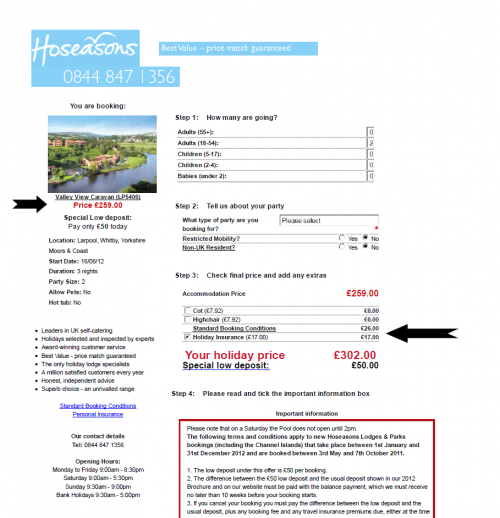
Below you can see a screengrab of the basket on hoseasons.co.uk after the user has clicked on the "book" button for a holiday listed as £259.00. You can see the original price (black arrow added for clarity on left to indicate) and the two extra items in the basket (black arrow on right - also added for clarity)
The insurance CAN be removed, however the user is shown a lightbox that warns them of the dire repercussions of opting out.
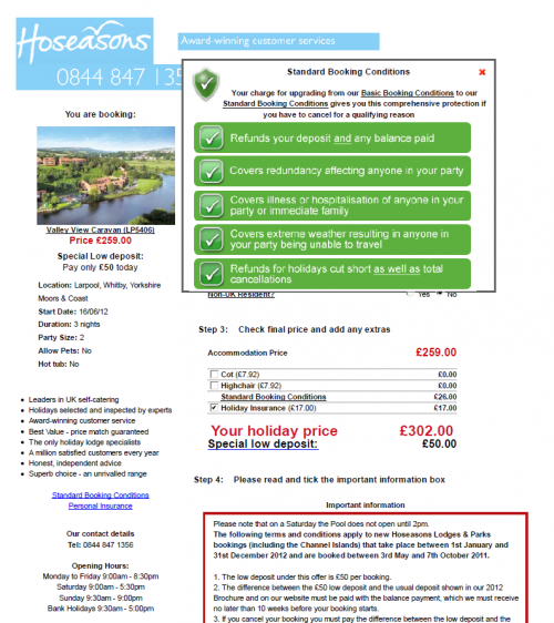
Similarly, if the user clicks on "Standard booking terms", they are shown a lightbox that describes this as being upgrade from "Basic booking terms". If the user takes the time to scroll though the lightbox content, they will see the (effectively buried) option to switch to "Basic booking terms" which are included in the holiday price. The confusion between "standard" and "basic" here seems to be intentional.
