Trick Questions
From Dark Patterns
Definition
The user is required to respond to a question (typically in the checkout process), which, when glanced upon quickly appears to ask one thing, but if read carefully, asks another thing entirely. This pattern works because it is normal for users to employ high-speed scan-reading on the web – see Steve Krug: ”We don’t read pages. We scan them.“)
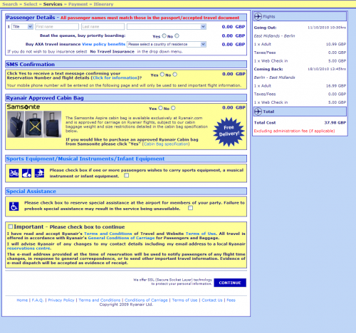
Example: Ryan Air trick insurance opt-out trick question. (August 2010)
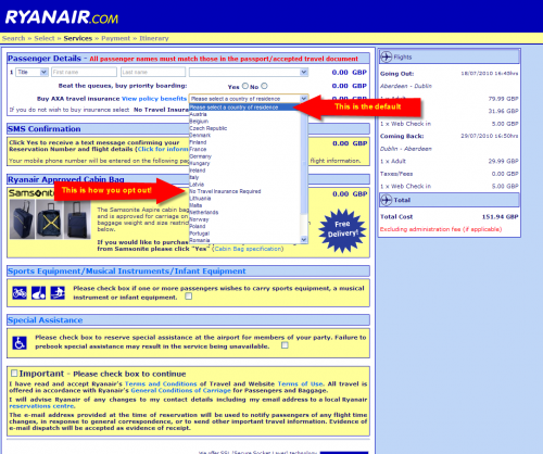
This example was submitted by Lee McIvor (here). Ryan Air cleverly uses an Anti-scan trick question, shown below. What’s interesting about this pattern is that it gives the site owner plausible deniability: they can claim that when you read the words on the page, it’s entirely clear what’s being said, so what’s the problem? In reality, people scan-read and a fair number of them will get caught out.
The screengrab below shows a close-up of the anti-scan trick question:
Look below to see what happens if you attempt to submit the form without picking a response. Note how only the dropdown box is highlighted – drawing draws the user’s eye to the rather benign-sounding “Please select a country of residence”. Very clever.
Example: next.co.uk free delivery / paid catalogue wordplay (September 2010)
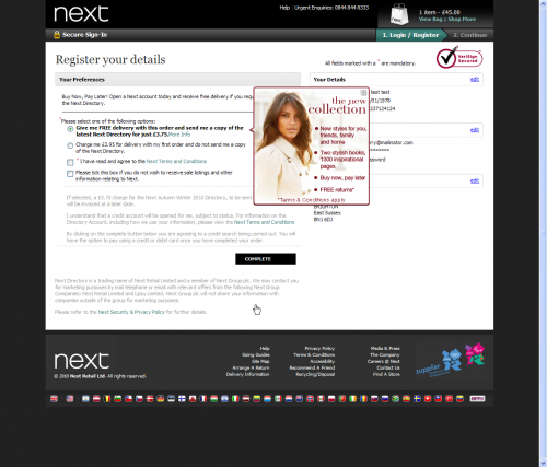
When buying any item from next.co.uk, the checkout page presents a tricky selection of options regarding "free/paid" delivery and a "free/paid" catalogue, as shown below.
The first radio button (preselected) reads "Give me FREE delivery with this order and send me a copy of the latest Next Directory for just £3.75." The second radio button reads "Charge me £3.95 for delivery with my first order and do not send me a copy of the Next Directory.".
This wordplay is known as Weasel wording. Note in the low contrast grey-on-white text below the radio buttons the user is forced to create a credit account to make the order: "I understand that a credit account will be opened for me, subject to status. For information on the Directory Account, including how we use your information, please view the Next Terms and Conditions"
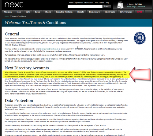
You may wonder what the Ts & Cs are for the credit account. If we take the time to look at them (which, let's face it, no normal person would), we see they hit the user will a recurring fee:
Example: Wired Magazine UK Print Subscription (Conde Nast) (August 2010)
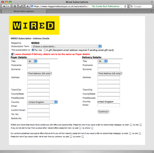
When you subscribe to the Wired UK print magazine from wired.co.uk, you end up on this page containing a clever group of anti-scan trick questions at the bottom of the page. As you can see in the screen grab, the sentiment switches on each line, from opt in, to opt out, to opt in, and back to opt out again. The text here is also smaller than the rest of page. This design makes it likely that a certain percentage of users will sign up for marketing messages without realising it.
Most web businesses measure and track the conversion rate for marketing preference opt-ins. Conde Nast seem to have struck on a design that delivers a great conversion rate, but at what cost?
Example: GoCompare.com (August 2010)
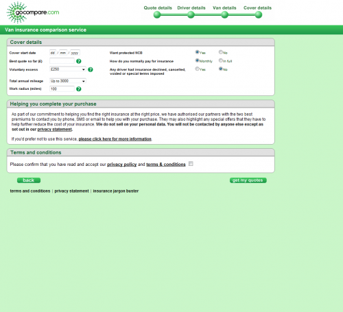
GoCompare hide their marketing-consent behind a “more info” link, as shown below:
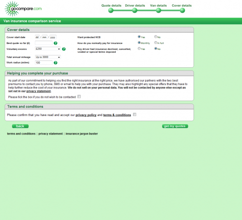
Clicking on “please click here for more information” reveals the opt-out:
It is likely that a percentage of users will not notice the fact that they are defaulted to opt-in to marketing messages, since the checkbox is hidden.
Example: Costco.com Uses Negative Check Box Tactic (November 18th, 2010)
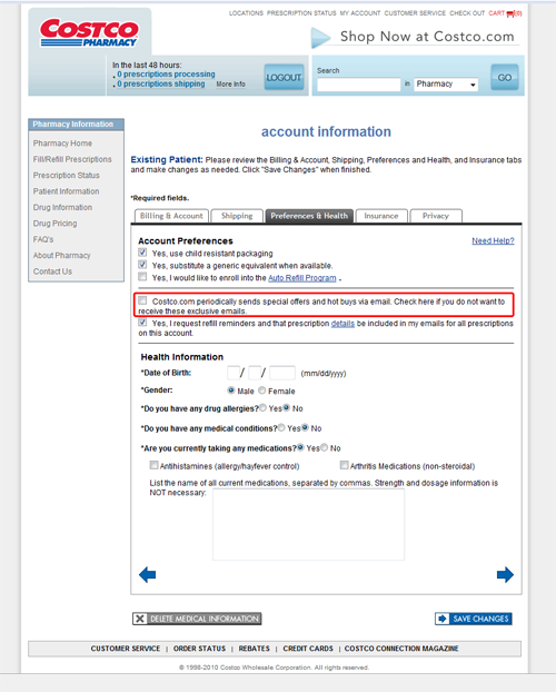
You can see in the image four typical uses of the checkbox form control but one sticks out. It conveniently omits the word “Yes” and is unusually more verbose than the surrounding checkboxes.
Reading the second sentence reveals Costco’s dark intention. It reads (emphasis added): “Check here if you do not want to receive these exclusive emails.”
The reason this is so sneaky is because its behavior is counter-intuitive. Checking a checkbox is typically a “positive” and “active” action. In other words, checking it indicates you want it to do something. Costco is intentionally sliding this checkbox (unchecked) in between other check boxes that they have found to be typically “checked” because they know most will leave defaults alone and skim over the rest.
Costco’s marketers love this tactic because it means more eyes on the ads they send out which, of course, means an increase in revenue.
Furthermore, if anyone complains Costco can simply indicate that they offered customers the option to “opt out”, which they did, but they did it without the customer’s trust in mind.
So, what say you Costco?
Example: Philips.com provides "impossible" opt-out UI (December 2010)
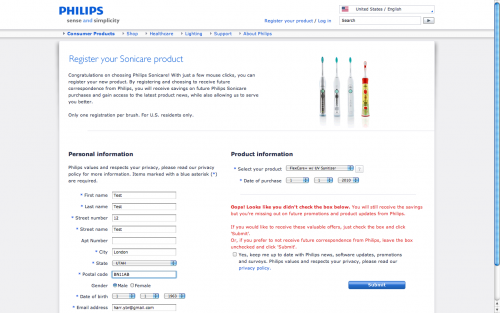
On Philips.com, when registering ownership of a product, you are taken to the form shown below. If you opt-out via the checkbox, you receive an error when you submit the form. This one was probably originally a mistake, but they clearly haven't rushed to fix it as marketing mailing lists are high value.
Example: PCWorld.com trick questions (December 2010)
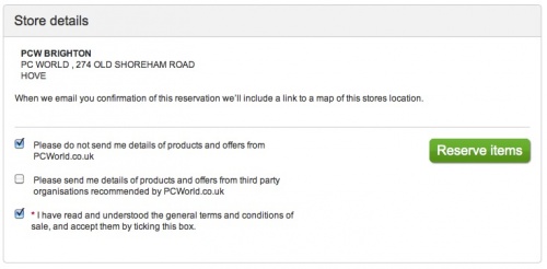
As you can see in the screen grab below, when ordering online from PCworld.com, users are taken to the page shown below. The sentiment of the marketing checkboxes switches from opt-out to opt-in. Like with the Wired magazine example above, this design makes it likely that a certain percentage of users will sign up for marketing messages without realising it.
Example: hotpointservice.co.uk bury marketing opt-out checkboxes (February 2011)
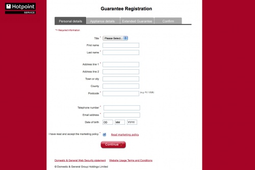
Whilst registering a Hotpoint appliance at www.hotpointservice.co.uk I discovered a trick where opt-in checkboxes were buried beneath a click.
The user is guided through the step-by-step registration process by entering their details and hitting continue. The user's progress is marked with a progress bar above the content area. So far, so normal. However, at stage one - Personal Details - there is a checkbox for the user to agree they've read and accepted the marketing policy, with a link to Read marketing policy.
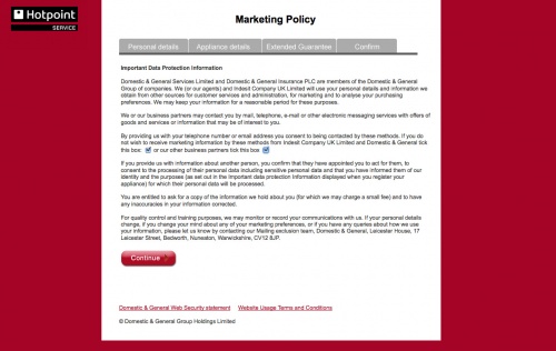
This could be a symptom of bad design, but what makes this a Trick Question is the average user wouldn't necessarily read the policy - it's common for the user to scan the relevant page and check the box which is the barrier to continue. The fact that there are further checkboxes nested inside the policy which is of concern. The opt-out in this case is made by checking the two boxes buried one level below inside the marketing policy, therefore catching the users who absently check the box one level up, agreeing they've read and accept.
It would be fairer to the user if the buried checkboxes required a tick to opt-in, or better still, make the options more transparent - putting them top level alongside I have read and accept the marketing policy as is standard on many other similar forms.
Example: Currys.com tricking quick readers into newsletter sign-up (November 2011)
The 'tricked you into a newsletter sign-up' tactic. Not particularly uncommon and oh-so simple: the first question is posed in the negative, as in 'do not send me details', whilst the second sentence is posed in the positive, as in 'send me details'. Quick readers, as most of us are, would simply tick both boxes assuming that, like the first, the second question is also a 'do not'. Sneaky.
Example: Subaru Australia employs more checkbox trickery (February 2012)
Similarly, requesting a car brochure on the Subaru Australia web site provides a combination of negative and postive checkboxes. The first and second options appear to be asking the same question in a different way.
